top of page
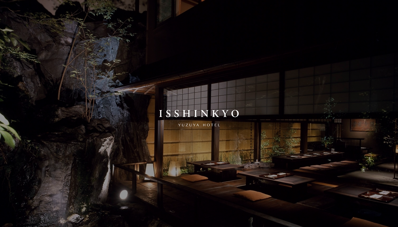
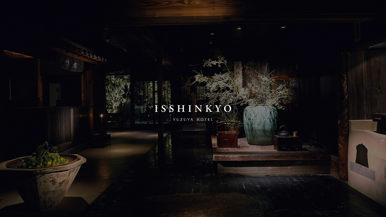
ISSHINKYO
Brand Identity
Brand Strategy, Art Direction, Visual System, Packaging Design, Website Concept
Created a modular branding system in Figma—spanning logo, packaging, signage, and digital interfaces—ensuring visual harmony across touchpoints. Guided the full creative workflow from concept through bilingual website implementation, elevating the restaurant into a refined, internationally harmonious identity.
Born from a personal dining experience in Kyoto, this project reimagines a kaiseki restaurant’s brand as an independent luxury destination—rooted in tradition, refined for a global audience.
The project’s objective was to elevate Isshinkyo—a refined kaiseki dining venue nestled within Kyoto’s Yuzuya Hotel—into an independent luxury brand. The restaurant possessed undeniable charm and cultural integrity, particularly in its use of yuzu as both a culinary and visual motif, yet the existing brand lacked consistency and polish. I sought to clarify its identity, enhance bilingual accessibility, and create a unified visual ecosystem that reflects its seasonal craftsmanship and premium experience.
Research

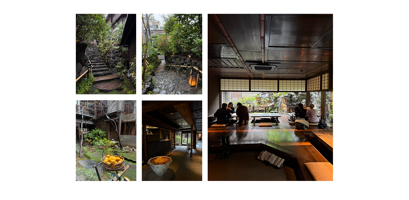
The inspiration struck during my visit to the restaurant, where the interplay of traditional Japanese architecture, the fragrance of yuzu, and the delicate presentation of each dish revealed a design potential that exceeded its current expression. While the on-site ambiance was compelling, the supporting materials—including menus, stationery, and the website—felt disjointed; the website in particular suffered from poor translation, cluttered layout, repetitive content, and low-resolution imagery, all of which undermined the restaurant’s elegance, especially for international visitors.
Research

My approach was to create an imagery-led identity anchored by the yuzu — a symbol of flavor, seasonality, and hospitality — balancing immersive tradition with subtle modern refinement. Isshinkyo’s strength lies in its authenticity; unlike other luxury dining brands that blend modernity and tradition, it remains firmly rooted in Japanese culture and detail-oriented craftsmanship. The rebrand was designed to express this character in a way that resonates with both local guests and design-conscious international visitors, bringing cohesion across signage, menus, packaging, and digital platforms so every touchpoint reflects the restaurant’s prestige.

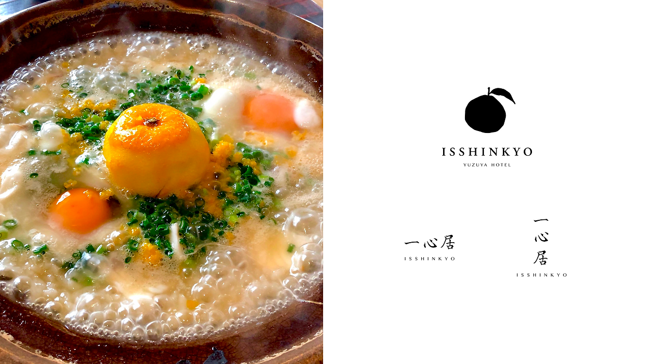
The logo was developed in two primary versions — a full English wordmark and a combined Japanese–English version. Retaining the Japanese characters was an intentional choice to preserve the cultural and traditional roots of the brand, reinforcing its authenticity for both local and international audiences. The yuzu motif from the original identity was refined into a mark that evokes the tactile quality of a traditional seal. Its hand-drawn, irregular line work draws from the visual language of Japanese paper-cutting and woodblock printing, giving it both a crafted imperfection and a strong graphic presence. This approach not only links the logo to traditional Japanese design heritage but also ensures it remains distinctive and versatile across applications, from printed menus to packaging and digital touchpoints.


The color palette draws from Kyoto’s Gion district and its shifting seasonal landscapes, using traditional Japanese hues — Deep Slate Olive, Sulphine Yellow, Naples Yellow, and Ivory White. These tones echo the restaurant’s natural surroundings and the visual rhythm of kaiseki presentation, while forming a sophisticated and versatile system for both print and digital applications. Typography pairs an elegant serif, conveying heritage and formality, with a calligraphic sans serif that introduces a contemporary, human note, preserving the hand-crafted quality of the brand while ensuring accessibility for a wider audience.


The course menu preserves traditional Japanese reading order, with English translations as the primary language and Japanese text directly beneath. The cover takes inspiration from classic Japanese bookbinding, printed on textured washi paper to evoke craftsmanship and heritage, and finished with a stamped logo seal for a ceremonial touch. Inside, generous spacing allows each seasonal dish to stand on its own, reinforcing the exclusivity and pacing of a fine dining experience.
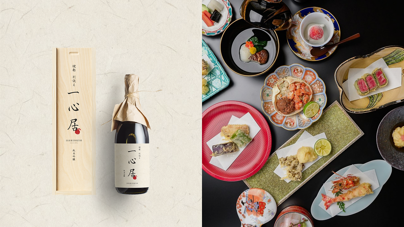
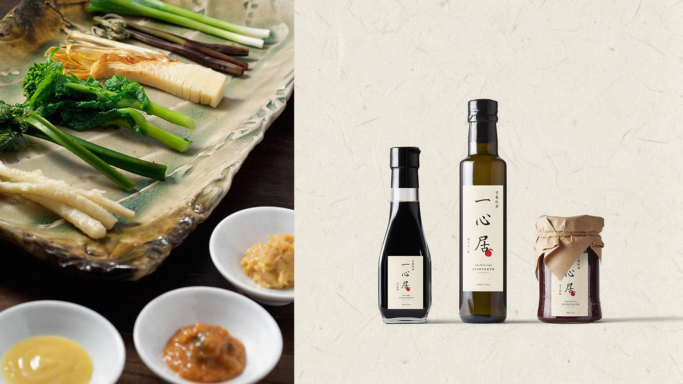
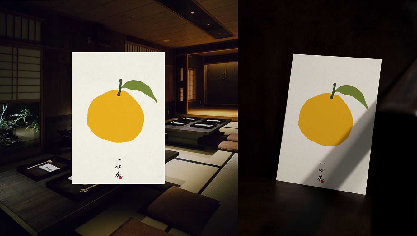
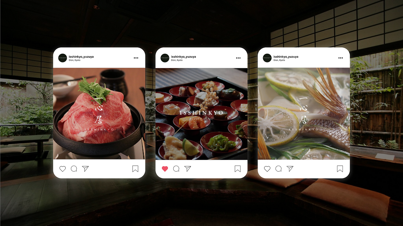
Packaging extends the brand into tactile form. The sake bottle and box follow traditional Japanese presentation, using natural materials, restrained typography, and refined wrapping techniques. Designed as a premium gift, the sake packaging reflects the restaurant’s high standards. A range of sauce packaging maintains visual continuity through consistent labeling, typography, and color application. Additional applications include a hand-rendered yuzu poster — a bold, minimal statement of the identity — and social media templates that merge atmospheric photography with the logotype, ensuring a consistent voice across platforms.

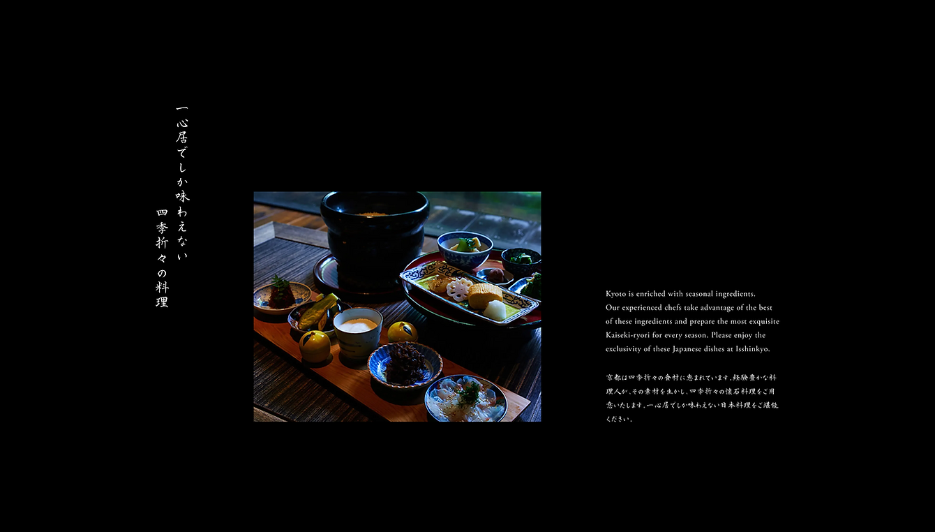
The redesigned website focuses on clarity, usability, and a refined visual tone. The original site’s lack of bilingual structure was addressed by creating separate Japanese and English versions with accurate, corresponding translations. High-quality, full-screen photography highlights signature dishes and interiors, while layouts are minimal, spacious, and image-driven, removing the clutter of the previous design. The typographic system carries through, combining vertical Japanese typesetting with clean, modern English to balance tradition with clarity, creating a digital presence that mirrors the elegance of the dining experience and makes it more inviting to international visitors.
In sum, this rebranding transforms Isshinkyo from a restaurant tied to a hotel into a distinguished luxury brand—one that feels deeply rooted in Kyoto’s heritage, but reimagined through a refined, internationally resonant design lens.
bottom of page